Motion Guidelines for Western Union
Motion Guidelines for Western Union
A journey of how we built dynamic and fluid experience that offer seamless transitions and intuitive interactions, integrating our design principles with Western Union as a brand, delivering a quality user experience.
A journey of how we built dynamic and fluid experience that offer seamless transitions and intuitive interactions, integrating our design principles with Western Union as a brand, delivering a quality user experience.
Scroll

Scroll
Context
Context
The current user experience of Western Union feels a bit dull, like a flat soda that’s lost its fizz🫧.
Users are a colorful mix, from college students sending cash for pizza nights 🍕 to seniors relying on funds for healthcare needs 👴🏼❤️👵🏼.
There’s a clear disconnect between the interface design and the real user experience.
The interaction comes off as too basic, almost like a game stuck on level one, missing the chance to truly engage and delight users 🎳.

Outcomes and Achievements
Outcomes and
Achievements
Outcomes
“It feels like our app finally moves the way money does—fast, clear, and confident.” - Devin McGranahan, CEO
Key Metrics
- 6+ product teams adopted the motion system
- Cut QA time for animation bugs by nearly 28%
- Created a shared language across design & dev.
- Enabled fast prototyping with motion baked into design system components.
- 6+ product teams adopted the motion system.
- Cut QA time for animation bugs by nearly 28%.
- Created a shared language across design & dev.
- Enabled fast prototyping with motion baked into design system components.
Phases
The origin
The origin
Microinteractions can boost user experience and add value for stakeholders.
Microinteractions can boost user experience and add value for stakeholders.
Pilot (Proof-of-Concept)
Pilot (Proof-of-Concept)
Creating a proof-of-concept that fares well on the user testing benchmarks.
Creating a proof-of-concept that fares well on the user testing benchmarks.
Final guidelines and tech implementations
Final guidelines and tech implementations
Creating guidelines and tech implementations that are dev friendly and are inline with Western Union as a brand.
Creating guidelines and tech implementations that are dev friendly and are inline with Western Union as a brand.
Collaboration till production
Collaboration till production
Providing support from not just a design POV, but also research support during development as well.
Providing support from not just a design POV, but also research support during development as well.

Phase 1: The origin
How it started?
How it started?
The lunchtime conversation opener
The lunchtime conversation opener
So, we were chatting at lunch and someone mentioned, "Hey, did you see that our rival, Revolut, just jumped into 3D design? They did it so smoothly! Meanwhile it’s hard to believe that we're still using loaders that look like they’re from the early 2000s!"
So, we were chatting at lunch and someone mentioned, "Hey, did you see that our rival, Revolut, just jumped into 3D design? They did it so smoothly! Meanwhile it’s hard to believe that we're still using loaders that look like they’re from the early 2000s!"
The thought that stayed
The thought that stayed
We recognize that while Western Union is a legacy company with centuries of trust, we must adapt to the evolving landscape. Western Union is not just a name revered by Boomers and Millennials; it has also gained traction among Gen Z.
This generation does not merely follow in the footsteps of their predecessors; they have their own distinct opinions. They can swiftly identify companies that fail to keep pace with modern trends. This disconnect can erode trust among Gen Z, and trust remains the cornerstone of success in the FinTech sector.


How it was done?
How it was done?
Brainstorming on what needs to be done
Brainstorming on what needs to be done
We had a fun brainstorming session with our designers and product managers to bounce around some ideas. We tossed out ideas and dug into them, pondered over thoughts and insights. Everything was shared on the Figjam Board.
We had a fun brainstorming session with our designers and product managers to bounce around some ideas. We tossed out ideas and dug into them, pondered over thoughts and insights. Everything was shared on the Figjam Board.
Seizing the opportunity
Meanwhile, somehow the stars aligned, and senior leadership visited India TEC. CXOs had come with a vision to take the product to a new paradigm. So we took the opportunity to present our idea to the CXOs and it immediately grabbed their attention
Meanwhile, somehow the stars aligned, and senior leadership visited India TEC. CXOs had come with a vision to take the product to a new paradigm. So we took the opportunity to present our idea to the CXOs and it immediately grabbed their attention
Phase 2: Pilot
Collecting the ingredients
Collecting the ingredients
Design Philosophy
When a project has the potential to influence multiple products across multiple markets, clarity is everything. So we began by distilling the design ethos of Western Union down to three core motion principles:
Intentional ✍️ — Motion should guide, not distract.
Realistic 🧲 — Rooted in natural physics like easing, inertia, and momentum.
Energetic & Witty ⚡️ — Reflecting Western Union’s human, brand-forward personality.
Secondary Research
Secondary Research
We analyzed 25+ motion systems—from Stripe and Google to Spotify and TikTok—dissecting what made their microinteractions feel natural and effective.
We observed:
Overuse of bounce led to fatigue
Poor easing made UIs feel either sluggish or hyperactive
Meaningful motion simplified cognitive load
We didn't want to just copy. We wanted to adapt—build something that's uniquely Western Union, while remaining flexible across use cases.
Getting the hands dirty
Design Lab madness
With all our learnings and insights that we had, we brought it back to our design labs and started creating some concepts.
With all our learnings and insights that we had, we brought it back to our design labs and started creating some concepts.
User Feedback
We conducted user interviews with those concepts that we created. Showed them to real users and collected feedback. Took them back to our design labs, perfected whatever was working, and learned from what wasn’t working. That helped us arrive the final foundations of our guidelines.
We conducted user interviews with those concepts that we created. Showed them to real users and collected feedback. Took them back to our design labs, perfected whatever was working, and learned from what wasn’t working. That helped us arrive the final foundations of our guidelines.
Phase 3: Final Guidelines and Developer Handoff
From Idea to Implementation
From Idea to Implementation
The standardization journey
After we were happy with the responses from users, we knew to add this into a design system, standardization is required. Because different set of designer/developer combo might end up using different set of values which might not be inline with our brand. So we created a set of Motion Guidelines for microanimations for the entire digital product.
After we were happy with the responses from users, we knew to add this into a design system, standardization is required. Because different set of designer/developer combo might end up using different set of values which might not be inline with our brand. So we created a set of Motion Guidelines for microanimations for the entire digital product.
Concept of “Beats”
Concept of “Beats”
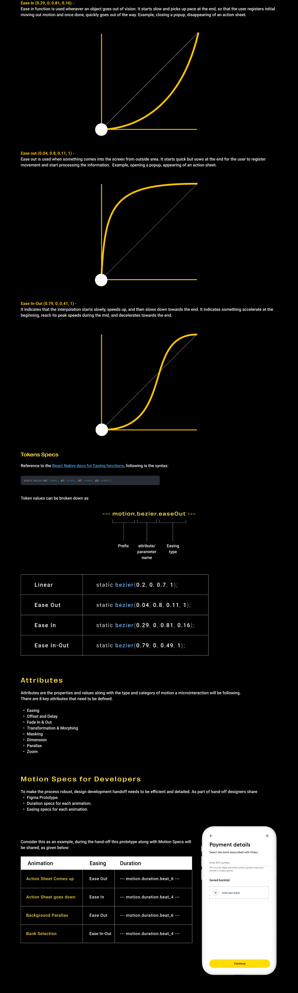
One of the challenges was the timing of animations. Fast and slow could be subjective. So we introduced a concept of Beats and categorized them from very fast to very slow. Now, nobody needs to physically remember the millisecond value for each timing, it’s just one of the beats from 1 to 12, depending upon the use case.
One of the challenges was the timing of animations. Fast and slow could be subjective. So we introduced a concept of Beats and categorized them from very fast to very slow. Now, nobody needs to physically remember the millisecond value for each timing, it’s just one of the beats from 1 to 12, depending upon the use case.
An inclusive nature
The Hand-off
While moving pixels could be seen as an easy task by many, we couldn’t overlook the development constraints given the tech stack we had. So we had multiple rounds of discussions to understand how would the devs would be consuming our designs. And we created a comprehensive set of development tokens for consistency, easy integration and clean hand-off.
While moving pixels could be seen as an easy task by many, we couldn’t overlook the development constraints given the tech stack we had. So we had multiple rounds of discussions to understand how would the devs would be consuming our designs. And we created a comprehensive set of development tokens for consistency, easy integration and clean hand-off.
Phase 4: Collaboration till production
Cross-Functional Adoption
Rolling out motion isn’t a one-time delivery—it’s a cultural shift.
So we partnered closely with:
- Engineering to validate implementation feasibility
- QA to standardize test criteria for motion
- Product to embed motion into feature roadmaps
We also created:
- A “motion onboarding” kit for new designers
- Embedded motion in Design System in Figma for drag and drop properties.
The lottie story
The lottie story
Implementation was a challenge as we wanted to create microanimations which were plug-n-play for the developers. Hence we leveraged lottie files to do so. After hours of export and experimentation with different dotLottie files and Jsons, we were able to build a system for developers.
Implementation was a challenge as we wanted to create microanimations which were plug-n-play for the developers. Hence we leveraged lottie files to do so. After hours of export and experimentation with different dotLottie files and Jsons, we were able to build a system for developers.
What’s next?
Standardisation taken a step forward
We identified various attributes of the UI patterns that we use and motion could be leveraged, namely,
Fade In & Out
Transformation & Morphing
Masking
Dimension
Parallax
Zoom
These attributes will be defined as a direction for designers and developers to use the specs directly in their designs.
We identified various attributes of the UI patterns that we use and motion could be leveraged, namely,
Fade In & Out
Transformation & Morphing
Masking
Dimension
Parallax
Zoom
These attributes will be defined as a direction for designers and developers to use the specs directly in their designs.
WunderBoi - Figma plugin for designers
WunderBoi - Figma plugin for designers
Remember Beats which we talked about earlier? It was simple and easy but still, who can remember the table of 75? And what’s fast, very fast, slow, etc. On top of that, how would we keep copy pasting curve values? Thus, we are building a figma plugin for this, where you just select the two frames, and select the values of time and curves, and VOILA!! the noodle holds the value from our guidelines.
Remember Beats which we talked about earlier? It was simple and easy but still, who can remember the table of 75? And what’s fast, very fast, slow, etc. On top of that, how would we keep copy pasting curve values? Thus, we are building a figma plugin for this, where you just select the two frames, and select the values of time and curves, and VOILA!! the noodle holds the value from our guidelines.
Quick Look


We missed something
We missed
something
The accessibility guidelines
We can’t forget accessibility (but i kinda did)
In our initial pilot success and excitement to build something that takes our Design System to a new heights, we missed a crucial step of accessibility. This got discovered during the initial user tests which we were conducting, where in one of the prototypes an old gentleman mentioned,
”Dear lord something moved, I wasn’t able to pay attention.” and we realised it’s not his fault. So we took a step back, and assessed where we went wrong, and we realised accessibility for motion doesn’t work the same way as the UI.
The guidelines for motion accessibility.
The guidelines for motion accessibility.
There were 4 major ideologies that we follow for accessibility for motion guidelines, namely,
Perceivable
Operable
Understandable
Robust
There were 4 major ideologies that we follow for accessibility for motion guidelines, namely,
Perceivable
Operable
Understandable
Robust
Outcomes and Achievements
Outcomes and
Achievements
Outcomes
“It feels like our app finally moves the way money does—fast, clear, and confident.” - Devin McGranahan, CEO
Key Metrics
- 6+ product teams adopted the motion system
- Cut QA time for animation bugs by nearly 28%
- Created a shared language across design & dev
- Enabled fast prototyping with motion baked into design system components
- 6+ product teams adopted the motion system.
- Cut QA time for animation bugs by nearly 28%.
- Created a shared language across design & dev.
- Enabled fast prototyping with motion baked into design system components.
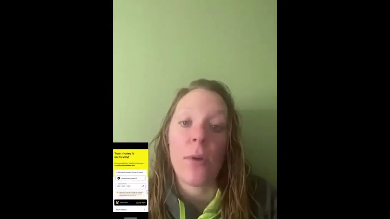
User Feedback
Hear what they say!!!




Reflections
“Designing motion at this scale wasn’t about adding flair. It was about designing with intention, for clarity, and at speed.” - Me, from the keynote in my imagination at 2.30 AM
“Designing motion at this scale wasn’t about adding flair. It was about designing with intention, for clarity, and at speed.” - Me, from the keynote in my imagination at 2.30 AM
What I Learned:
Tokenization is the bridge between design and dev
Microinteractions can carry macro impact when done right
Good motion doesn’t call attention to itself—it just feels right
Figma needs to add a feature where prototyping can become a standard design system entity.
Tokenization is the bridge between design and dev
Microinteractions can carry macro impact when done right
Good motion doesn’t call attention to itself—it just feels right
Figma needs to add a feature where prototyping can become a standard design system entity.
Thank You!
Thank You!
“Motion is the UI’s heartbeat. Our goal was to make sure it never skips a beat.”
- Me, from the keynote in my other imagination during shower
“Motion is the UI’s heartbeat. Our goal was to make sure it never skips a beat.”
- Me, from the keynote in my other imagination during shower